Introduction:
In an industry rife with competition, KARTE Marketing set out to create a speculative beer can design that would encapsulate the rich history and premium quality associated with German Pilsner. The outcome was a masterfully designed set for both tall and short cans, seamlessly combining tradition with contemporary aesthetics.
The Challenge:
Without specific guidance from an end-client and amidst a vast market of beer products, our task was to conceive a design that would both honor the German brewing legacy and make a distinct mark in a global market. The objective was clear: craft a visual identity that communicates purity, premium quality, and rich heritage to primarily English-speaking audiences.
Our Approach:
Infusing History & Quality:
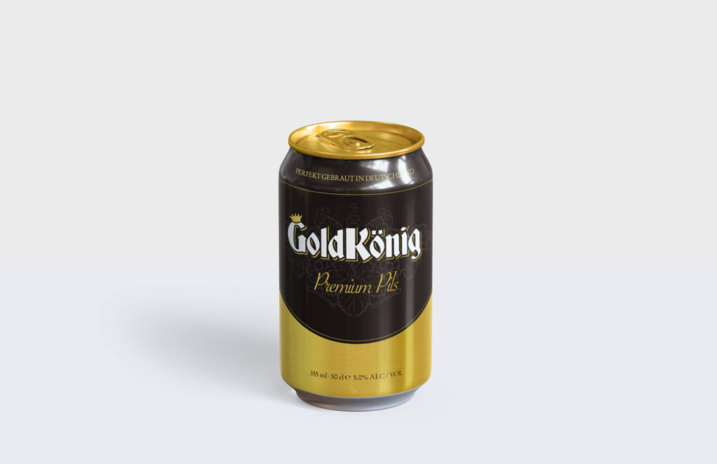
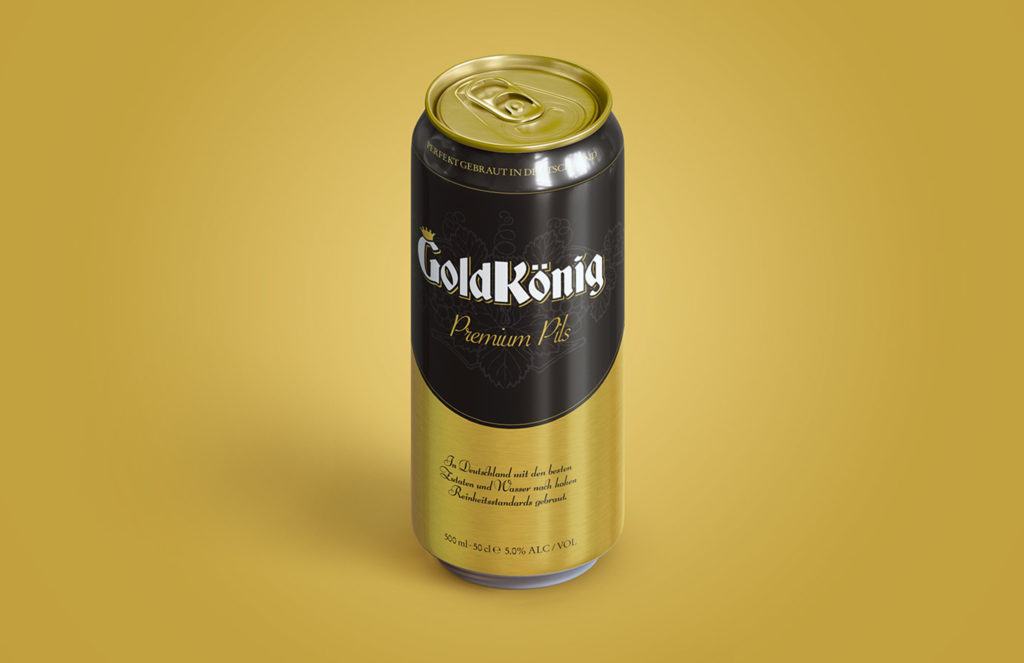
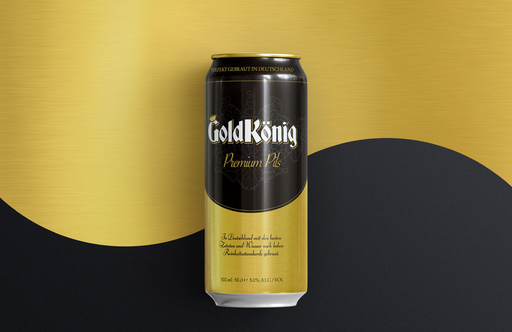
Rooted in the time-honored German purity laws, our choice of gold, black, and white colors for the can design aimed to evoke feelings of authenticity and premium quality. The gold signified the richness and high standards of German brews, while the black and white provided a crisp contrast, reminding consumers of the purity and simplicity of ingredients used in the brewing process.
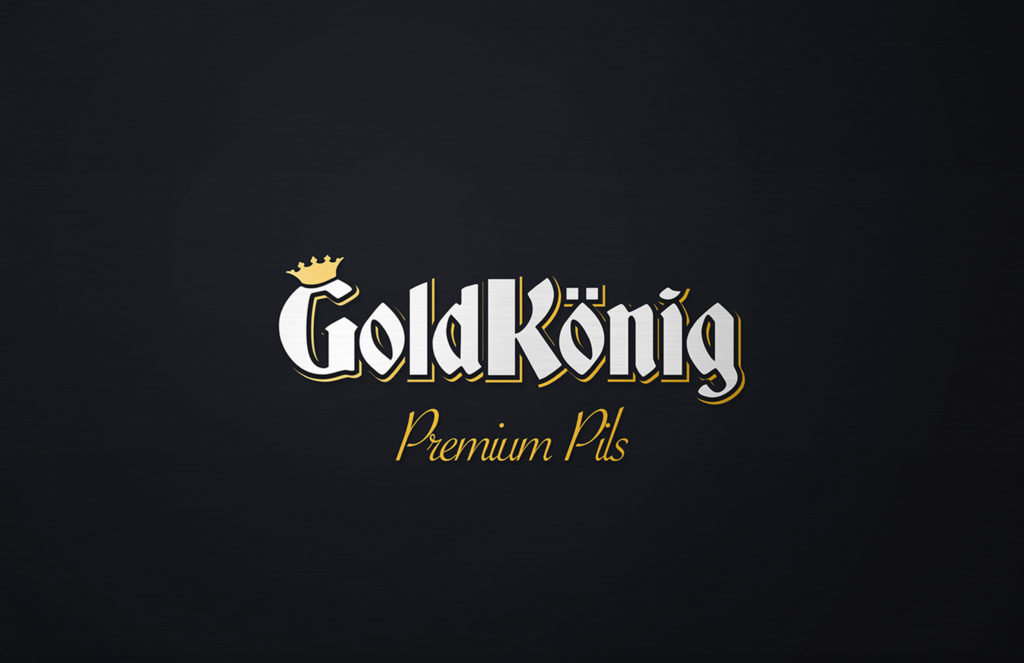
Typography & Iconography:
The typeface, heavily influenced by Gothic Germanic scripts, was chosen to imbue a sense of tradition and rich brewing heritage. Complementing this was the iconography of a crown, intelligently included to ensure that English-speaking audiences would grasp the regal nature of the beer, even if they couldn’t understand the German title.
To further the narrative of luxury and prime quality, subtle line silhouettes of hops were integrated into the design, and text inscriptions hinting at the beer’s elite character were incorporated. These design elements combined to reinforce the beer’s positioning as a high-end, imported beverage.
The Result:
The German Pilsner beer can designs, in both tall and short variations, emerged as a harmonious blend of tradition and modernity. They succeeded in communicating the superior standards of German brewing practices and the premium essence of the Pilsner, making it appealing to a global audience that appreciates and seeks out luxury foreign beer brands.
Conclusion:
The German Pilsner design initiative showcased KARTE Marketing’s expertise in capturing and conveying a product’s essence through design. By seamlessly blending historical elements with modern aesthetics, we delivered a product that stands as a beacon of premium quality in the beer market.