Introduction:
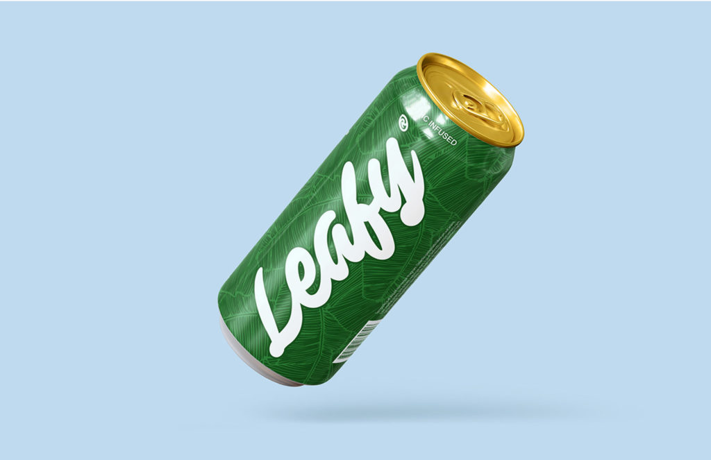
In the vast expanse of the beverage industry, where each product clamors for consumer attention, KARTE Marketing embarked on an ambitious internal project. Our aim was to design a beverage package that harmoniously blended modern aesthetics with sustainability. The outcome was the innovatively designed “Leafy” slim aluminum can.
The Challenge:
The primary objectives behind the “Leafy” package design were manifold. We needed to create a design that would not only distinguish itself in a market overflowing with choices but would also resonate with the consumer. At the same time, the design needed to be functional, innovative, and immediately captivating.
Our Approach:
Conceptualizing the Theme: Given the moniker “Leafy,” we naturally leaned into a nature-centric theme. This theme would embody both the visual aspect of the design and the overarching sustainable ethos of the product. A palette of earthy tones peppered with vibrant greens was curated, intending to encapsulate elements of nature, freshness, and vitality.
Crafting the Can’s Design: For the Leafy beverage can, every design decision was made with meticulous care, ensuring it catered to our target audience and could carve its niche in the highly competitive market. The slim aluminum can was chosen for its sleek appearance, but also for its sustainable and recyclable properties. A distinctive dark green background was chosen for the can to ensure that it stood out. At the center of the design was a bold, tastefully designed logo that immediately drew the eye. This was paired with an assertive typeface, ensuring that the brand made a memorable imprint on the consumer’s mind.
To enrich the customer experience, content was thoughtfully placed on the side of the can. This content was meticulously crafted to engage customers, encouraging them to understand more about the product as they held the can. Moreover, the key features of the beverage were prominently displayed at the top of the can. This placement was strategic, ensuring that the most attractive aspects of the product were the first to be noticed.
The Result:
The “Leafy” beverage can, with its fusion of aesthetic brilliance and purpose, garnered considerable admiration. Its ability to differentiate itself in a crowded market was evident from the positive feedback it received. The design’s harmony of bold logo placement, striking typeface, and the dark green backdrop effectively captured consumer attention. The strategic positioning of the product’s prime features at the can’s top ensured that its primary selling points were instantly visible, further adding to its allure.
Conclusion:
The Leafy package design project stands as a testament to KARTE Marketing’s prowess in marrying design with strategy. In a time when consumers seek products that echo their values and stand out on the shelves, the Leafy design epitomizes KARTE’s dedication to innovation, sustainability, and market trend acumen.